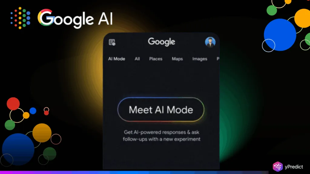
Google’s AI Mode cursor now blinks through the company’s signature colors — yellow, green and blue. It’s this minutia that caught the attention of Andreas Storm on September 1, 2025. What appears to be just simple eyecandy actually delivers a strategic jolt. The sequential blinking isn’t just aesthetically pleasing. And it unobtrusively reminds them of Google’s brand while they’re typing their queries. Each color flash links back to that good ol’ logo we all know and love. This micro-interaction makes a simple text input suddenly feel Google-y. The cursor turns into a stealth brand ambassador, laboring away in the background. Users might not be aware of it, but their brains detect the color scheme familiarity. This also subtle brand reinforcement with each keystroke. It’s clever because it’s so understated.
How Branding Shapes User Experience
Good UX design infuses brand identity into every interaction. As the Interaction Design Foundation puts it, good branding is much more than logos and color palettes. It also determines user experience — how it makes people feel to use a product. Google’s blinking cursor is a perfect example. The colors don’t merely decorate the interface – they convey brand personality. Ingenuity, convenience and dependability all sparkle in this brief cartoon. Users feel like they’re working on something innovative and reliable. The cursor makes it feel familiar in an unfamiliar AI world.
This psychological ease spurs you to dive deeper into the tool’s potential. When users are comfortable, they’re more prone to explore and find new functionality. The rotating color sequence also gives the nice effect of subtle feedback that it is listening and waiting. This responsiveness instills confidence in the AI’s abilities. Brand touches like these transform an interface of utility into an experience that people remember. They turn mundane queries into brand impressions that linger with internet users long after they’ve closed their browser.
The strategic design behind AI Mode
Google’s AI Mode opened with purposeful design decisions designed to seem “new, different, and special.” The blinking cursor dovetails beautifully into this vision. It indicates to users that they’re in a power search world, not just another text box. The moving piece indicates the system is thinking. This display feedback alleviates user concern about if their input was registered. The cursor animation fits with Google’s more general thrust toward multimodal search. Voice, image and text all get the same branded treatment.
This regularity is important particularly in markets such as India, where AI Mode rolled out on June 24, 2025. Visual and voice searches rule there, so intuitive design is essential. The blinking colors inform users that they’re in a magical search mode without requiring any explanation. The animation lightly turns the search experience into a game. Users could be anticipating the subsequent color. This micro-engagement keeps its attention on the search box. Pretty neat trick for making query typing feel like something more interactive and engaging than a plain old search interface.
The Power of Thoughtful Details
Little design decisions make huge differences on user experience. The sequential color cursor shows how small things can build brand affinity. Studies find these subtle visual cues do a great deal to impact user behavior and recall. Google’s framing establishes a new standard for branded experiences in AI interfaces. Other tech companies will probably follow suit, blending branding into design to be used as actual features. This cursor demonstrates that branding and user experience are not disjoint issues – they are synergistic energies. Correctly executed branded micro-interactions serve to improve usability, not detract from it. The blinking animation doesn’t impede typing or search.


